
- admin
- April 23, 2014
- 5:24 am
Using CRM Dashboards to Motivate Your Sales Team
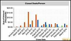
Closed Deals per Sales Rep
 Transitioning
This chart can show the number of closed deals per rep per month or the dollar value of those deals. Who has the
most closed deals? Whose sales numbers are through the roof this month (and whose aren’t)?
Comparative sales dashboards not only provide you with a look at who is performing, who is improving and who is
slipping, but they also allow the team to see their numbers stacked against their teammates. No one wants their low
sales performance on display for long. These charts can provide a healthy push for an increased effort.
Expected Pipeline Value Per Sales Rep
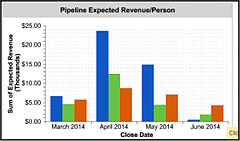 Salesforce dashboards not only allow you to see the past, but they also give you a crystal ball to see into the
future. After all, pipeline visibility is one of their core selling points.
By creating a dashboard on expected pipeline value, you’ll know what’s in the works for the upcoming months, and
know who is responsible for getting it done. Which salespeople have a fat pipeline with deals ready to be closed?
Who isn’t cultivating their market well? Who is on pace to reach their sales targets? Use these graphs to keep
yourself and the team informed and motivated.
Monthly Team Sales Goals
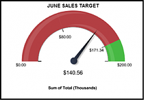 While individual performance is important, in the end you are a team. Showing the performance of the team against
targets provides a fun visual incentive. If you attach bonuses or prizes to certain targets dashboards can further
incentivize your team. You can use the Salesforce Recognition tab with work.com to build merit
badges that fit your goals.
Free Download
How To Get Your CRM Back on Track
Categorized
Posts you might also like...

6 Leadership Quotes on Delegation to Inspire You to Greatness
February 5, 2023

How a Delegative Leadership Style Improves Team Success
February 5, 2023

How to Use MOCHA to Delegate Effectively
February 5, 2023

